
Last modified: 2006-04-15 by antonio martins
Keywords: peace | peace sign | campaign for nuclear disarmament | holtom (gerald) | russel (bertrand) | aldermaston | rune | semaphore |
Links: FOTW homepage |
search |
disclaimer and copyright |
write us |
mirrors
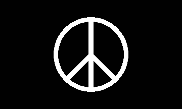
The actual colors and sizes seem to vary. I’ve seen
white on black (pictured) most often; others are white
on blue, green on white, and pink on black. The most
common proportions are 3:5.
Steve Kramer, 29 May 1996
The peace symbol has a convoluted and confusing history.
It’s most notable appearance in modern times was its first
use by the (U.K.) Campaign for Nuclear Disarmament (C.N.D.)
at their Aldermaston march in 1956. The C.N.D. meaning of
the symbol is semaphore for
"N"
(the two diagonal lines) and
"D" (the two vertical lines).
About ten years later, the
symbol was adopted as a general peace sign within the
student anti-war movement. It became probably the single
best known symbol of the youth culture of the sixties.
T.F. Mills, 09 Oct 1996
The “peace sign” was
designed by Gerald Holtom in 1958. The frequently-repeated
but mistaken belief that it was designed by Bertrand Russell
probably stems from the fact that Russell was the president
of the C.N.D. at the time. The first public use of the
symbol was on flags and placards during the 1958 Aldermaston
march (in England). It was described in Manchester
Guardian articles covering the march.
Bruce Tindall, 28 May 1996
Before his death, Gerald Holtom handed a number of personal
documents to his nephew Tim, who in turn gave the to his
youngest son, Darius, who now lives in France. Included with
these writings are many of his original doodles, which show the
process leading up to the peace sign end-product.
Tim Holtom, 8 Mar 1999
The symbol consists of the semaphore
letters "N" and
"D" (for "nuclear disarmament")
inside a circle. The
original colors were, as shown in the image above, white
on black. According to The CND Story (by John
Minnion and Philip Bolsover, 1983)), Holtom and other
C.N.D. artists pointed out other symbolism in the flag as
well: the semaphores together, without
the circle, look
like a stick figure with its arms outstretched — «the
gesture of a human being in despair»; the circle
represents the womb or unborn generations, as well
as the world; and the color black represents eternity.
Bruce Tindall, 29 May 1996
Another, presumably “unofficial”, explanation is that
it is the cross of Christ with the arms drooping in
despair. The symbol is also, in fact, the Death Rune of
the Futhark runic alphabet. Whether this is an intentional
similarity or not, C.N.D. supporters, particularly
Christian ones, used to get very uppity when this was
pointed out!
Stuart Notholt, 30 May 1996
The C.N.D. (Campaign for Nuclear Disarmament) was partly based on traditional churches, and I think they were also conscious of mixing two historic Christian symbols:
It is also used on US flags
in regular colors, as a pacifism flag.
António Martins, 05 Dec 1999