Last modified: 2007-06-16 by antónio martins
Keywords: guerreiro (gomes) | rings: 4 | hinc patriam sustinet | instituto superior de agronomia | eagle | orange | coat of arms (portugal) | um | temple | inp | discs: 16 |
Links: FOTW homepage |
search |
disclaimer and copyright |
write us |
mirrors
Most flags of universities in Portugal are all logos on plain
background.
João Madureira, 10 Apr 2003

The flag of my university, the University of Algarve is a blue
logo-on-a-bedsheet with the University symbol in white at the centre.
The wording "UNIVERSIDADE DO ALGARVE" is part
of the symbol, so it is a necessary evil, so to speak. If I recall
correctly, the meaning of the eccentric circles is related to the
levels of activity of the institution (itself, the city, the region
and the country) and to the expansion of the knowledge.
Jorge Candeias, 26 Mar 1998
As far as I can remember, the creator of the University symbol was
Gomes Guerreiro [the first Dean of our Uni, JC] and the significance was
rather related with the complexity of Life: cell, tissue, organ, organism
and intelligence.
Frederico Cardigos, 24 Mar 1999

Founded by decree the 16th December 1852 as Instituto Agrícola
de Lisboa (Lisbon Agriculture Institute); after some time in which a
veterinary school was adjoined to it, under the same of Instituto de
Agronomia e Veterinária (Institute of Agronomy and Veterinary); the
two were separated in 12th April 1911, this one moving to its current
location at Tapada da Ajuda (in Lisbon). ISA is currently part of
UTL (Universidade Técnica de Lisboa - Technical University of
Lisbon). As a curiosity ISA is also the home of the oldest student union
in Portugal, founded in 1911 as well.
Website: www.isa.utl.pt/
João Madureira, 10 Apr 2003
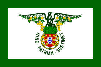
A flag flies outside the main building — it is the only one
I’ve seen so far. I don’t believe it has an official status,
but I could be wrong. It consists of the emblem of ISA plus
"Instituto Superior de Agronomia" underneath it. Special attention
should be payed, in my opinion to the emblem, and its strange
bird-tree combination over the national arms.
It’s surely the most curious symbol I’ve seen in portuguese flags
for awhile. Also interesting the motto
"HINC·PATRIAM·SUSTINET".
João Madureira, 10 Apr 2003
The motto «Hinc [facultas agronomica] patriam
sustinet» means «Hence [the Agronomy Faculty] the Fatherland
supports». The last word is stressed on the first syllable:
"sústinet".
António Martins, 28 Sep 2004, quoting Gonçalo Neves

I’ve seen a different flag design with the emblem only (without
"Instituto Superior de Agronomia") on white but with a wide green border
all around.
João Madureira, 21 Jun 2003

Instituto Tecnológico e Nuclear (ITN, or Technological and Nuclear Institute; with website here) in which takes place research and teaching in the field of nuclear energy, and where the only portuguese nuclear reactor (an old heavy water facility) operates. Its headquarters are just outside Lisbon, in the city of Sacavém, Loures municipality.
Recently, this institution made the news due to a EU inspection that detected some flaws in the monitoring of radioactive levels in materials used at the ITN. One of these news items was a newspaper article illustrated with a very light flag with a very dark logo. Since the logo at the site is black, I assumed it to be the colour of the logo in the flag, and as for the background, it’s almost certainly white.
Jorge Candeias, 25 Nov 2004

Universidade Moderna, Modern University, a private university
with its main facilities in Lisbon and a few delegations spread throughout
the country. It came under mediatic attention when a scandal involving its
previous management broke out. Today, most of that management is under
arrest, charged with fraud and several other white collar crimes.
Ever since, this flag has been a constant sighting on the news.
Jorge Candeias, 27 Aug 2003
The flag is red with the symbol in white, consisting of the letters
"UM" next to a stylized portion of a greek temple, over the
full name of the institution and under its motto displayed in arc.
Unfortunately, I was unable to find information about the motto, or images
with a legible motto, so this image is, so far, incomplete.
Jorge Candeias, 27 Aug 2003
The symbol as found today in the university’s website is
somewhat different, so some changes might have happened in the flag in the
meanwhile. If so, however, they do not show up in the news.
Jorge Candeias, 27 Aug 2003

Instituto Superior das Novas Profissões (Superior Institute of
New Professions), or INP, is a private school devoted to the teaching of
«corporate sciences», as they define it.
A curious soundbyte relates to the difference between the logical sigla,
ISNP, and the one actually used: the institution changed its name. It was
originally called simply "Instituto das Novas Profissões",
and only recently added "Superior" to that.
Jorge Candeias, 29 Jul 2003
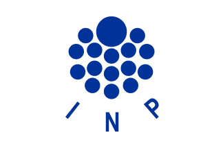
The flag it’s a white cloth with the logo of the institute in deep blue.
This might be an erroneous depiction, and the flag might contain other
elements, invisible in the photo source I used.
Jorge Candeias, 29 Jul 2003
It has a website at www.inp.pt/
but I was unable to find any reference to the logo, and therefore cannot
explain what it’s meant to stand for, if anything. It’s
pleasing to the eye, made of one large disc and 15 discs half the size
of the big one, but that’s all I can say about it.
Jorge Candeias, 29 Jul 2003
Anything below this line was not added by the editor of this page.